If you are new to this blog, it probably would be to your benefit to start at the bottom post and work your way up. This blog is sponsored by weshoot.com, where you may see many examples of architectural photos, and bilbord.com, where you can see extensive retouching and enhancement of building images. Its purpose is to give anyone who wishes to photograph building interiors and exteriors the knowledge of how to do so correctly, and what to do in post-production work to make their images better and more professional-looking. I will periodically be adding to this blog. Please note that I do not allow blogspamming in comments, and any attempt to do so will wind up with the comment being removed.
Thursday, December 27, 2007
Using additional lighting allows a balance for high-contrast lighting from in-scene light sources within your photos. Let's say you have an image that shows a great-looking exterior back yard that is seen through a window in a living room, during the day. Our eye sees the outside part and the inside part, and can readily see both. That is because our eye adjusts for both amounts of light. If we take an image of the interior, with the idea of showing detail within, and don't use additional lighting, the outside detail will "blow-out," and will appear as an overexposed part of the image, usually obliterating the window itself, the sill, the drapes, and anything directly between the window and the camera.
One method I employed for years is using "hot lights." These are continuous lighting, usually tungsten based, to cut the contrast between outside and inside. This may involve timing the inside and the outside exposures to make sure that we get an accurate exposure for each and merging the images together for an image as our eye sees it. Please see our archive: http://learnarchitecturalphotography.blogspot.com/2005_09_01_archive.html to get an idea of this type of image.
I decided that strobes would help cut down on post-production work better than using hotlights, and have purchased a set of high-powered monoblock studio strobes from White Lightning. The advantages of shooting with strobes are many. One, strobes shoot with daylight. That means less color variation between outside and inside (warm tones inside, cyan tones outside). I take a reading from outside through the window. Let's say it says f16 @ ¼-second. I set the lens at f16, the shutter at ¼-second, and the strobes at f16. Since the strobe is the main light in the room, and is fired in less than a small fraction of a second, the resulting image shows detail inside and out. Another factor is that hotlights sometimes required long time exposures. This would cause severe halation around room lights, causing loss of detail in and around the lights. Because faster shutter speeds are possible, I can get better lighting detail in the image.
I should warn you that studio strobes aren't cheap. You need a lot of light power to photograph large areas at deep depth of field. I checked out many lighting types and makes. Paul C. Buff, Inc. had the most powerful lights (White Lightning X-3200s) available, were more reasonably priced than just about anybody else, made regular wall-plugging AC units that could plug into batteries, called Vagabond IIs, which they also sell, and had a great staff to work with. These units were also compatible with some of my old Balcar accessories, so I saved a little money that would have gone toward the accessories. You can find them on the 'net at: http://www.white-lightning.com/ . I have even used these strobes and battery-packs outside, shooting at night. It gives me a lot more versatility.
Check out what real lighting can do for you. Happy shooting, and Happy New Year.
Labels: White Lightning
Friday, June 01, 2007
Anyway, this photographer sent my client all the sheets of all the images taken, good, bad, and indifferent. The client has no background at choosing which images to use. I feel this was totally unprofessional of the other pro. The client should not have to make a choice of the best images out of a bunch of what I feel were less than high-quality exposures.
My advice to that photographer? Go digital. At least you can see the images on the monitor on the back of the camera, and even though focus is not easy to tell on a screen that small, exposure is easier to see. At least improve your images by using better technology.
Labels: hacks in our business
Thursday, November 23, 2006
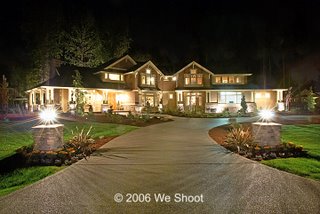 Getting a raw deal can be a good thing! Of course, I am talking about using raw images for your photography. If you are using a digital camera that does not have the capability to shoot raw images, and aren't interested, you can tune out. But, if you can shoot in the raw format, or think you might want to shoot raw at some time, you might want to read this.
Photographers with DSLRs usually have a choice of shooting raw, shooting jpegs, or shooting raw with the addition of the same image in a jpeg. There are probably some fixed lens cameras that offer the same options. If you haven't tried out the raw format, you should.
My first "high-res" digital camera was the Nikon Coolpix 990. It was (believe it or not), 3.34 megapixel. It offered 3 resolutions of jpegs, or the output of tiff images. It did not offer raw. The 990 was a great camera, and I made money with it. I decided to use the highest res jpegs as the tiff images it shot were no better than these jpegs, and they took up a lot more room on the compact flash card. In those days, a 32-meg card was quite expensive (way more than I recently paid for a one GB card), and would only hold around 4 tiffs, but would hold 23 high-res jpegs. The choice was clear. I would shoot jpegs. Jpegs, however, have an Achilles Heel. If you keep saving them over and over, the way I would during retouching, they will start artifacting like crazy. So, once an image was taken and copied to the hard-drive, the first act was to convert it to a tiff, which can be saved over and over again with no image loss. The tiff was only as good as the original jpeg, however. Jpegs don't have a whole lot of latitude. Something on the order of film transparencies - about 5 f-stops from dark to light. Raw images only show the same 5 stops latitude on a computer screen, but have a couple of additional stops that the image can be moved through for adjustment.
A lot of pro images these days are composites of several exposures to allow for the outdoors being brighter than the indoors, etc. See the images of the Japanese spa in the archives on this blog (Sept 2005) to get the gist. One of the things you can do with a raw image is darken or lighten it 2 to 3 stops in either direction. That means that if you have a perfectly exposed or slightly dark interior and you darken the raw image in a good raw image editor, the outdoors may become more visible through the window. You can make a tiff image of the darker version and layer it with a tiff image of a lighter version of the same image. This exends your latitude. In Photoshop, you can erase the window area of the lighter version on the top layer to expose the darker version underneath.
This brings us to the choice of a raw photo editing program. This may be difficult to follow for neophytes, but if you are interested, the terms will become more familiar the deeper you get into it.
I had recently just bought a new Nikon D80, which had been out for all of 2 weeks when I decided to purchase one. This is a 10.2 mpxl camera, and runs around $1,000.00. Now, my main program for reworking images is Photoshop CS2. It has a program called Camera Raw which is supposed to open most raw images. It, however, would not open the raw images from the new D80! It seems that the new plug-in was not yet available for this new camera's raw images. I ordered the camera to take night shots (like the one in this post) because it had better low-light capability than my old cameras. Only thing was that I needed to open and edit the images yesterday. Now, the Nikon D80 came with some software called Picture Project. It is not really a raw editor. It is more of a raw opener. There are almost no adjustments available, and the image can be exported as a 16-bit tiff only. I needed something better. I got advice from another photographer. He said to try Phase One's Capture One software. He swore by it. I downloaded the cheaper version, LE, which came with a 15-day free trial. I tried it out, but it was missing some features that I would need for my work-flow. LE was priced around $125.00. I then downloaded the pro version (with a 30-day free trial) and I liked it better. It costs around $500.00 list. That price made me swallow hard. After some wheeling and dealing with a representative, I was able to negotiate it down to $450.00. Still a lot of money to edit raw images. I wasn't convinced I would like to spend that much moola. Then Adobe came out with a beta version of Camera Raw with raw capability for the D80, and it was free. I took the same image and edited it with the Adobe program, and also with the Capture One program. Hands down, Capture One was the better choice for output. I went on the 'net to see what Nikon had for raw editing. They had come out with Capture NX, and it worked with the D80 images. I downloaded the Nikon program and it had a 30-day free trial. It went for $149.99. I edited the same raw image again with the Nikon program and compared the tiff images produced. The Nikon program was the clear winner here. The image looked the best with Capture NX, and it had a feature that the others don't seem to have: control points. I can spot lighten, darken, saturate, or change the contrast of a partial area on the image. And the price suited my pocketbook. I bought the Nikon program. If you have a Nikon, you might want to check out Capture NX. If you have another brand, good luck.
Wednesday, October 04, 2006
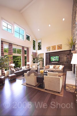
I have been very busy with residential shooting. I will not be able to add to this blog until I have finished several jobs. Hopefully, I will be able to get to the blog some time next month. In the meantime, here is an image from one of my current shoots.
Monday, September 04, 2006
There is a second way to keep uprights unkeystoned, using Photoshop, or other editing programs. Take the image with the camera's film plane and lens vertically parallel to the sides of the structure (as most photographers have to using fixed body cameras like point-and-shooters, 35mm body cameras, etc.). This will most likely result in an image where the structure has too much foreground and not enough sky. This is a common problem for those taking images with a camera with too long a lens. Having to get back in a field to get the whole building in the image will usually result in this type of image, with more field than you probably want.
Photoshop comes to the rescue. My solution is to increase the size of the canvas upward in Photoshop. This allows me clone in more sky above the building. I then crop the image back to my original aspect ratio, and I have less ground and more sky, a better look.
Saturday, September 02, 2006
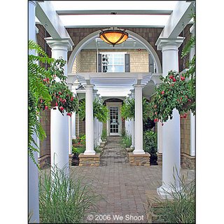
Is it possible to take architectural photos with a low-priced camera?
My answer is an emphatic Yes! Especially if you have an exterior image to do. Interior images sometimes call for lighting, placement of elements within the image, and exposure requirements from mixed lighting. For exterior images, the sunlight should ideally come from behind the photographer, even on an overcast day. It avoids cloudiness in the image from halation and flaring if the light is behind you. So waiting for the ideal time of day is important. For architectural images, the camera lens has to be parallel to subject so the uprights do not "keystone," or recede into the distance. Sometimes, you will note that this is hard to do, as the structure will sometimes be on the top of the image, with a lot of ground in front, i.e. parking lot, lawn, etc. So, many photographers turn the lens upward to get rid of the overabundance of ground, and instead, get the dreaded keystoning, especially more pronounced with wide-angle lenses. That is why architectural photographers used those cameras with the bellows. This type of camera, often called a view camera allowed the photographer to bend the image in the camera to the point that the uprights became straight again. It was also possible to adjust the side-to-side keystoning that occurred.
So, how do you correct this distortion with a low-priced digital camera? One way is to shoot with your camera as parallel to the subject as possible. If placement of that object in the photograph is not where you want it, and you have to tip the camera upward, Photoshop, or another editing program can come to the rescue. In Photoshop, simply make a duplicate layer of your image from the layers palette, and go to Edit>Transform>Distort, and play with it until it looks straight.
The image at the top of this post is an example. It was shot with our A620 Canon 7.1 megapixel camera, and slightly tweaked in Photoshop CS2. You can see this camera on my blog at http://buyandsavealot.blogspot.com/2006/08/using-your-computer-and-internet-to.html to give you an idea. We purchased this camera for $217.83. Not expensive at all.
Thursday, September 22, 2005
Many years ago, while cutting our teeth on weddings, a double-exposure meant two exposures on the same piece of film. Sometimes mask filters were employed, like a dot and a circular hole. One clear filter had a black dot in some part of it, say, in the center. This was used while taking an image of the dancing at the reception (or other such scene) and would keep part of the film frame unexposed for the second part of the exposure. The camera had a means to keep the film from advancing while the shutter was cocked, and the first filter was replaced by another, this time with circular hole placed where the dot was on the first filter. An exposure was then taken of a close-up of the bride and groom, placing them as presiding over the scene behind them.
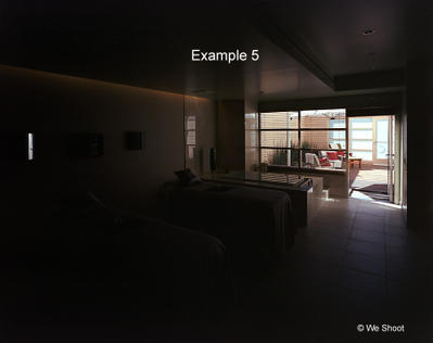
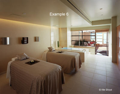
In architectural photography, a similar thing can be done in the digital age, whether shooting on film or capturing an image with a digital camera! The reason is a little different, though. If you have lots of money and a crew to assist you on an interior shoot, and are aiming towards the outside windows, you can use neutral-density filtration materials on the windows and cut down the amount of light entering the room from outside. This cuts the contrast between the darkness of the room and the brightness of the outside. This way, the scene outside, be it a garden or a pool area, are not blown out in the image. I will illustrate how to use two negatives to shoot the image and marry them in Photoshop. This can also be done with digital images. This is the poor-man's way to shoot such an image without a crew of grips, and spending money on much neutral-density material. This particular shot would have been hard to do with neutral-density sheeting, as the door to the room was open - no glass. See Examples 4, 5, and 6 below:
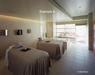
Example 4 shows the room, a 4x5 neg exposed to show enough detail in the room, while not changing the mood, which was supposed to be relaxing and soothing. We could have lit the room up to cut the contrast between inside and outside, but it would have ruined the mood. The outside is all but blown out.
Prior planning is everything, and we brought extra film and Polaroids to handle a situation such as this. Example 5 (another 4x5 neg) shows the same image exposed for the light outside the room. This made the room dark and with not enough detail for a finished image. This part of the final image has to be shot at the same aperture as before, as the image will be bigger or smaller in size compared to the first, depending on the aperture. Only the exposure time is less on Example 5 than on Example 4.
Example 6 shows the marriage of the two images, with a bit of a massage in Photoshop, blending the two images. Example 6 is a more pleasing image than Example 4, and closely mimics what we could see with our own eyes while we were in the room.
Plan for these images, and take the exposures necessary to ensure that you will be able to make the image you envisioned.